 |
| Agile Burndown Chart Excel Template |
Agile Burndown Chart Excel Template Free Download
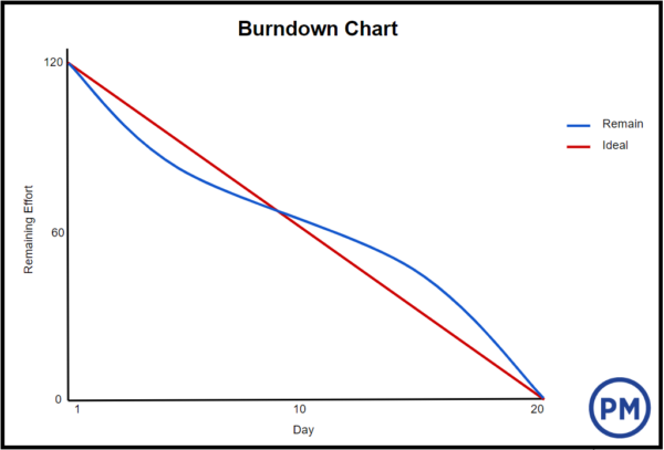
A burndown chart shows the amount of work that has been completed in an epic or sprint, and the total work remaining. Burndown charts are used to predict your team's likelihood of completing their work in the time available. They're also great for keeping the team aware of any scope creep that occurs.
Burndown charts are useful because they provide insight into how the team works. For example:
- If you notice that the team consistently finishes work early, this might be a sign that they aren't committing to enough work during sprint planning.
- If they consistently miss their forecast, this might be a sign that they've committed to too much work.
- If the burndown chart shows a sharp drop during the sprint, this might be a sign that work has not been estimated accurately, or broken down properly.
How to Read a Burndown Chart
The burndown chart has several points. There’s an x-axis, which is the project or iteration timeline. The y-axis is the work that needs to get done in the project. The story point estimates for the work that remains is represented by this axis.
 |
| Image source:projectmanager.com |
The project starting point is the farthest point to the left of the chart and occurs on day zero of the project or iteration. The project end point is farthest to the right and marks the final day of the project or iteration.
Download also:
References: projectmanager - atlassian

Post a Comment